England's Bolton Wanderers have an absolutely ghastly design that must have originated sometime between 1975 and 1985.

Cornelius, the Corn Flakes rooster, is pulling in a little extra pay in his second job as AS Ascari's logo.
Denmark's FC Midtjylland makes a bold choice, using Courier for their logo.
Nottingham Forest's crest appears to depict the results of French nuclear testing in the Pacific.
Hannover 96's logo would be great for a gas station.
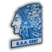
Chief Blackhawk asks himself, "What the hell am I doing in Belgium?"
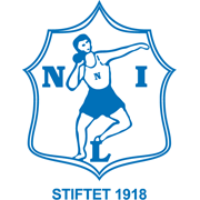
Players at Nybergsund in Norway are known for their curious throw-in technique.
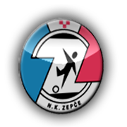
N.K. Zepce play in Bosnia, and it would appear that their style of play involves tripping over the ball, then getting crushed between converging walls.
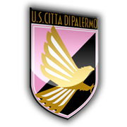
If it weren't for the oddly-placed pink, Palermo would have the most awesome logo in all of sports.

No comments:
Post a Comment