So I've decided to start getting rid of Arial in my life, starting with my browser. Firefox and Safari both let you specify new fonts for browsing, but only Firefox lets you override the pages' default font selection. Let's see the difference, shall we?
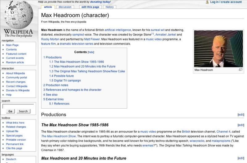
Here's the web in Arial, as you've probably been seeing it.

Ho-hum. Bleh.
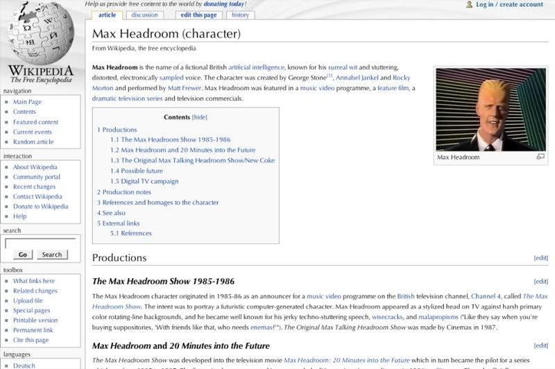
Now let's try something made by a professional designer, not by some schmuck at Microsoft. Like Optima.

Better, don't you think?
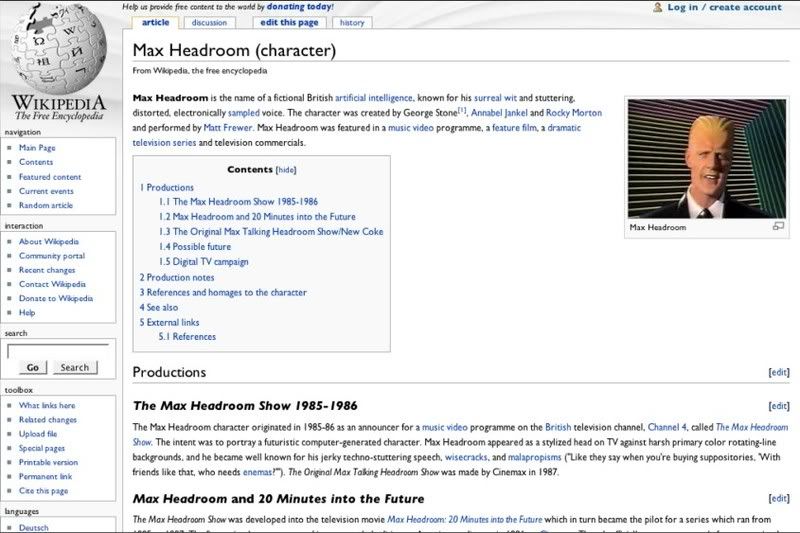
If you had a little trouble reading Optima at small sizes, then maybe you should try another classic, Gill Sans.

Gill Sans looks great bolded.
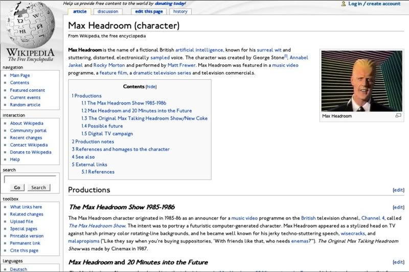
Of course, those are professional fonts, and if your computer doesn't come with them you'll have to pay for them. But there are plenty of good free fonts available at Fontspace. You're looking for legibility at small sizes and a full set of characters.

This one's called London Tube and it's a little funky but looks a lot better than Arial.

2 comments:
I agree with your distaste in Arial. This list agrees also:
http://www.100besteschriften.de/
I don't agree at all. I think the Arial screenshot is most readable and looks better than any of those others.
Post a Comment